Sunday, April 6, 2014

Evaluation - Question 5

What have you learned from technologies in the construction of your product? 

Camera for filming


For our opening we used this camera. It is a standard DSLR that i own which is the NIKON D5100. It was very useful in the filming of the product due to it's HD filming setting but also good sound quality to ensure that the conversation between Emma and Harry was nice and clear when it came to the editing stages. Furthermore, by using this camera we were able to get all the shots which we needed such as the close ups as the lens of the camera has a good zoom on it. Due to it being a DSLR, we were able to make the opening look more professional by using the focus ring around the outer part of the lens effectively. This meant that we could focus on foreground, not background or vise versa. Especially during the vital conversation between Emma and Harry, the technique i used to film this was to place the tripod further away from the object you want to film (the characters) and then zoom using the lens which meant that it takes more for the camera to focus. This way it was a lot easier for me to focus on the person that was talking and blur out the character who was sitting facing away from the camera. This enabled the audience to focus more on the character who was talking as they have a higher importance at that time in order to hear the dialogue.

Tripod


The tripod was a very important piece of equipment used to make our opening. It allowed us to get the steadiness of clips spot on as it was able to take the weight of the camera without tilting in any way. There were some parts of the film which were easier to film without the tripod as it only extended to a certain height and for the section in the opening where Emma is walking into the train station and there is an arc to the right, this was easier to film by hand due to me having to stand on the wall to film. We found that it was very useful when it came to various camera shots and movement, one of the being the establishing tilt shot as Emma is walking through the entrance of the train station. It gave us a stable fluent movement, which require no editing what so ever on the mac. The fact that we could adjust the lengths of the poles around the outside meant that we could get the perfect height for each of our shots and ensure that there was a consistency and continuation in shots such as during the conversation: we had to make sure that the tripod help the camera at the same level throughout so that it was more realistic.


Music Download

One thing which was important in our opening was the choice of music. To make sure that we had the right music we spent a lot of time exploring indie songs on YouTube. The website which we used to then download this song was 'YouTube to MP3'. This allowed us to copy and paste the video link into the website for it to then convert the file into an MP3 format to open in iTunes ready to use on any media product we wanted. We used this website for the song at the very end of the opening, and we found that this website was very useful as it meant that we could download a song so easily and quickly. 


However, as our first song was by a small YouTuber, she didn't have the song on YouTube, only the acoustic version (https://www.youtube.com/watch?v=bDOtbjWkIpw) which wasn't clear enough and therefore would make our opening look a lot less professional. She did record the song and the only was of getting this song to use was via the website she provided. I also managed to get hold of Emily who recorded the song to ensure we had rights to using her song and she was very enthusiastic about us using the song in our opening. The website which her song was available on was 'band camp'. This is a small website which supports the smaller artists who are unsigned. We paid through paypal with a small cost of 79p. This made us aware of how we preferred this was of getting a song as we were make sure that the artist gets credit for their work as oppose to downloading a song for free.

Editing software

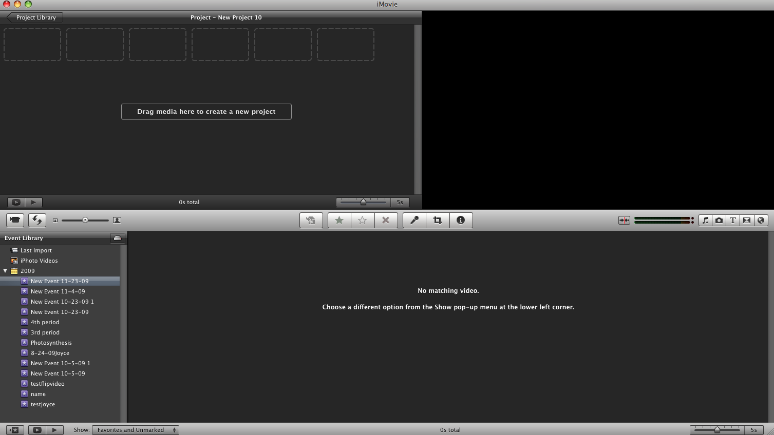
For our entire media opening we used imovie. This is probably the best editing software that we could use as it is as advanced as it needs to be but its so easy to work out and use. Imovie was so useful as it meant that we could perfect our opening, and it meant that we could afford to have some small problems with the film.
It allowed us to do the following things: 

  1. Edit sound - voiceovers, volume of tracks, ducking, music
  2. Stabilize clip motion
  3. Change the colour, brightness, opacity, contrast etc 
  4. split clips and add in transitions, crop the clip
  5. create titles using a font that we simply downloaded


Evaluation - Question 4

Looking back on the preliminary task what do you think you have learnt in the progression from that to the actual production?

Camera Shots
Here i am going to talk about the improvement in camera shots, which includes positioning in the frame too. This is in order to conform to ideas of conventional mise en scene (in order to show off costume and make up which was intentionally placed in the opening). The preliminary task was very useful as it was the perfect test run to prevent us from making too many mistakes during the production of our opening. 


During the shots which show conversation between the two characters, we learnt a lot about the positioning of the camera for the conversation. Both of these shots are meant to be wide shots, which is not evident in the preliminary task. We found that due to not planning the shots for the preliminary task and not knowing the meaning behind the shots, we didn't frame them properly so they aren't technically a shot. The conversation is meant to be in the centre of the frame, which perfect from out film opening as we made sure the tripod matched the camera up with equal amounts of space either side of the bench. Where as in out preliminary task, the camera is placed too far to the left meaning that one of the characters is more centre than the other.


Another aspect of the conversation which was vital was the shot/reverse shots. I found that when looking back at the preliminary task we didn't use the correct level for the camera. So, what we did was we tended to have the camera higher up or closer to one person which meant that the camera showed them from the wast up and then on the other character it showed them from the knee up. This was inconsistent and should be shown to be level. However in our actual opening we made sure that we places 2 objects the same distance from each other which showed us where we would place the tripod. The tripod then ensured that the camera was pointing in the same direction at the same level meaning that we always got above the waste and below the shoulders.
The conversations also conformed to the 180 degree rule in that we made sure we had an imaginary line between the two characters which we switched between in order to get a sense of realism.


Long shots were not as effective in out preliminary task. We tended to forget about how much of the character that was supposed to be within the frame when filming it. Because of this we were a lot more aware when creating our actual opening. In the preliminary task we kept cropping out the feet which should have been included to show a full body and the action of walking into the classroom. Where as in out actual opening we made sure that we placed the camera way from the character as much as we needed due to the fact that you can always crop the image but you cannot add in any more image without re-filming. Our long shots were more effective. 

The 180 degree rule
Our preliminary task actually showed a great example of how to abide by the 180 degree rule. Due to our research into the 180 degree rule, we made sure that we did it perfectly in our preliminary task which then enabled us to do it just as well in our actual opening. Here is an example: 


Preliminary task:
in the preliminary task we imagined the line was through the centre of the door. This meant that we filmed only on the one side of the door allowing chlaryse to look as though she is walking in the same direction. The editing of this clip was also very handy as it was a straight cut and matched the action well. 
Our opening: 
We used the 180 degree rule in our opening during the montage. This was so that as an audience you could really see a sense of travel and direction in which Emma was walking. 

Tuesday, March 25, 2014

Evaluation - Question 3

What kind of media institution might distribute your media product and why?
We created a prezi presentation to write up all the information about our distributor - fox searchlight. This was a more creative way of presenting the information and meant that we could section all the smaller questions within the presentation. 

Saturday, March 22, 2014

Evaluation - Question 2

Who would be the audience for your media product? 
The video for question 1 took a long time to make as i hadn't planned what i needed to put in it so i spent a lot of time deleting a re-adding clips and coming up with more ideas as i made the video. To avoid this i wrote a plan of what i am going to include in the second question to save time and make sure that i have included all the things that i need to.


On the plan i have written about what i am going to include which is mainly referring back to the research that i did at the planning stage. This includes the survey monkey results, target audience video and mood board images. i have written the main findings from the planning again and the written about how we have achieved the in the opening.


Video

Evaluation - Question 1

In what ways does your media product use, develop or challenge forms and conventions of real media products? 
For this question of the evaluation i made a video using my nikon D5100 and iMovie to edit so that i could include footage from my media opening but also refer back to examples of conventional ideas that we used which are in current media products. The main things which i talk about in the video include: 

The significance of the reflection at the beginning
Connection with the character through certain shots
Use of voiceovers 
The setting of the opening 
Reasons behind our decisions
Character choice and the mise en scene choice of the characters
Choice of music
Overall opinion of how i feel the opening used or challenged the conventions of existing products.


It took me a long time to make the video as i had to write the voiceover script and think about suitable music where you could hear the voiceover. I also had to get relevant clips from opening in my research stage. I am happy with how this section of the evaluation has gone and i think i am going to do more sections of my evaluation in this style 

Wednesday, March 19, 2014

'I've got time' - Our opening


Choosing our distributor - research into institution


Fox searchlight
We did a lot of research into finding which distributor would be most suitable for out film which we classed as 'independent'. We came across Fox searchlight amongst this and decided that this would be the right choice as it specialises in distributing independent British films, just like ours. It is owned by 'Fox' which is a large American company and works on distributing british films to American audiences but also internationally. Here we have one of the main reasons why we picked this distributor as it means that we would have so much more of a larger audience ranging to america and we can have the link with the hollywood industry which would allow the opportunity for our film to grow in popularity.
 

Tuesday, March 18, 2014

Changes to the opening

During the production of the opening we came across some difficulties which lead to a range of changes, in order for us to use our time effectively and to get the best result.
The main change was the role of Emma. We chose to have a protagonist who came from a different school which caused difficulties with days and times in which we were able to film - and with all the changes and small bits of re-filming we had to do it just wasn't ideal and we would not have got our opening done in time. To resolve this issue we used Katie who is in our group to be in the actual film and play the part of Emma which has worked very well.
After the change in character we found that the classroom scene we originally thought of sounded a lot better in our head and wasn't that achievable with the equipment that we had so we changed the second half of the opening to a school bathroom scene which i will explain next to the storyboard.
Another thing we had to change was the train station section. we found that some of the clips werent all that good and stable and then script needed changing due to it not sounding right or flowing very well therefore i re-filmed the whole train station section with aaron and katie acting. 

How the filming and editing turned out: 
after all the changes that we made, we had to change around the filming side of things as well as the editing as we had a lot less time and had to divide jobs up within the group.
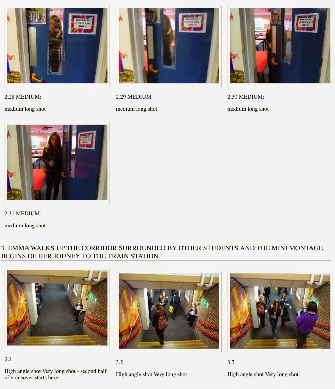
We came to a decision that me and Katie would film and edit the second section of the opening: this includes the journey montage to the train station, and the actual train station scene and chlaryse and jade would film and edit the fist section in the toilet including the difficult task of voice-overs which we had a lot of trouble with. I additionally helped film some parts of the first section as it was my camera and knew how to focus on separate sections in the frame.
Katie was an actor in the film so i filmed all of the fsecond section and katie edited all my shots together however we helped eachother with the framinig when i was filming and i helped katie with some of the editing too. 


Changes to the character
This is the updated character profile for Emma. We didn't have to make many changes to the character profile, the main changes included the appearance of the character, the physical description of Emma. Another thing that we altered was the habits of the character which we also portrayed within the filming. This was that she played with her hair a lot which can give evidence that she is an awkward and socially nervous person. The traits of the character, however have stayed the same as we always had an idea of how we wanted Emma to act.


Script
Firstly we changed the script before we knew about the change we were going to make to the classroom scene. We kept the whole beginning section the same including the voiceover but had to alter the conversation between Emma and Harry. The first time that we filmed the train station scene, we noticed that the quote that aaron read out from the oliver twist book didn't sound right - it didn't sound like a quote from the book at was very udeen to the point that it seemed a bit creepy. Because of this we decided to show aaron saying 'that's a classic, that is' which seemed like a better, less stange conversation starter. This flowed so much better and we managed to include some more shots which capture the emotion when Harry noices what Emma is reading.


The second and final changes that we made to the script was the beginning. Once we had filmed the classroom scene and it wasn't as successful as we hoped it would have been, we changed our idea to the school toilets which helped us stick to the conventional reflection beginning shot. We added in a section where emma gets knocked by one of the other girls in the toilet which reinforces the idea that she is invisible and also a school bell the rings which cuts off the music and establishes the school environment. We were happy with the final script as we felt it all flowed a lot better and the voiceover matched the shots better.


story board
This is the final story board. We updated all the images of the first scene from the classroom to the school toilets and this ensured that we had more of a variety with the shots and camera movement. This scene looked so much better than the classroom scene due to us having a lot more time to film it so that we had stable, professional looking shots. It was difficult to film the scene due to the mirrors, this meant that we had to ensure the camera wasn't in the shot at any point in the reflection and that the background was completely clear.

Tuesday, March 4, 2014

Shooting schedule

Origional shooting schedule
This is the shooting schedule which we decided to use as it was the days where the cast were able to participate. In order for Rhiannon (the protagonist) to be able to take part we had to arrange it for when she finished early from school as she does not go to the same college as us. We also had to make sure that aaron was free for the wednesday and that we were able to get other students of out age both male and female to be characters within the classroom scene. 


character profiles

The protagonist - Emma Turner
For Emma's (rhiannons) profile we chose to dress her in very plain clothing but also thought carefully about some of the smaller details that can tell a little more about the character. Things such as the bracelet from her other set up the plot a little as it will be introduced later in the film and the bracelet will have more significance. We also included the fact that she has the same traits as the ones we gathered from our research such as the hobbies that she has - this will make her more relatable as a character. 


Harry Ryder - The love interest 
We also made Harry (aaron) have very plain clothes so that he is someone that wouldn't usually get noticed when you walk past him. The fact that he prefers trains as oppose to buses as a public transport because he feels safer can connote that he isn't the strongest character and struggles fitting in with the rest of society. 

Script - I've Got Time

This is our final ides for the script. We had to make a lot of changes as originally it was a lot longer and emma and Harry had a longer conversation. 

The first, longer script included: 
Harry and Emma talking about the book in more detail and harry noticing her name on the bookmark - emma was the confused by this as to why someone is talking to her due to her being so used to being ignored. It gets late and they have both missed the last train so Harry offers to walk her home, however it is about a 40 minute walk so emma tell him to just leave it and she will walk along but he replies with 'I've got time'. This is where we got the idea for our film title. The main dialogue after this was when harry and emma got to half way home for Emma and where she feels uncomfortable to walk the rest of the way home because she knows that her step dad will be angry and she doesn't want harry to see this. The conversation then takes a strange turn and harry becomes suspicious as to why she has suddenly changed her tone and got all up tight about things. 

Conclusion
After looking at all the things that we were trying to achieve, we realized that realistically we would never be able to fit this into a two minute opening. In fact we noticed that we went into too much depth and that would in fact be about 10 - 20 minutes long which is quite a large section of the film. 
We realized that all we really needed to fit into the opening was a little bit about Emma's life and the moment she meets harry leaving an enigma to know what happens after they have met.


Story Board Images


Saturday, February 15, 2014

Preliminary task

Our Preliminary Task
Katie, Chlaryse, Becky and Jade


For out task we had to film footage of someone walking through a door and sitting down to exchange a short conversation with another person. To do this we used chlaryse and Katie from my group and i filmed. We made sure that we included a variety of different shots such as a close up of the handle, the pan of the room, mid shots, wide shots, match on action. This made sure that the short film would look as professional as possible. We did some research before doing the take on the 190 degree rule - this was so that all of our shots looked right. We found this video on the left which explained to us the rules of the rule and ensured that we didn't break them - which we didn't. We made sure tt we had one line either side of the door and whilst she was walking into the classroom, but also in between me (the filmer) and katie and chlaryse (who were having the conversation being filmed) during the reverse shots. To help with this we used i movie to edit together the clips and to adjust all the audio levels. I am please with how the task went and i think that all the shots are edited together nicely.

Tuesday, February 11, 2014

Group idea of overall plot, opening plot and characters

Overall plot and character information
After each person in the group doing individual planning of an idea for a plot for the entire film, in class we used our time to discuss the ideas that we all come up with to produce a general idea between us. We filled out a grid on paper which i have copied up in more detail on Microsoft word explaining the stages in the film. It also includes a lot of information about the characters: the name of the characters in the film, the names of the people playing the characters, the role of the character, whether or not they are shown in the opening, a description of the character and then finally how they are represented throughout the film.


Focusing on the opening
Now that we had come up with an idea for the entire film, we had to focus more on the opening and coming up with the stages of that as a group. To do this we filled out a table explaining all the different aspects of the opening, including: creation of enigma, introduction to characters, setting up the plot, pace & rhythm and mood & tone.

Sunday, February 2, 2014

Brainstorming the story - My thoughts


My thoughts on the film:
The protagonist, main idea, opening of the film, rough idea of the whole plot.
In order to make the opening as effective as possible, it was important that as an individual i could come up with a plot for the rest of the film but also an idea of what i thought would look good for an opening. As a group we decided that each member of the group would come up with a plot for the rest of the film and an idea for an opening so that we could come together in class and try and come up with a general idea of a plot for the rest of the film between us. By doing this we can all input our ideas to get a bigger variety of things we could include in our opening that will set up the rest of the fill well giving an element of mystery. To do my individual brainstorm i used a website called bubbl.us which allowed me to write as much as i wanted. 
Most of the ideas on my mind map revolve around the research we had done into things that outcasts tend to do. So i included the fact that she could be reading at the train station to show the whole interest in reading (makes it more relatable). I also included the whole idea that she enjoys taking photos everywhere she goes to document the nice things in life which wasn't a popular interest on the survey, this means that it would be different and could inspire other teens to be more like the female in the story.

Entire Documentary

Documentary
This is the entire documentary video that me, Katie, Chlaryse and Jade made. We all took separate roles in the documentary so that we all did our fair share in editing and all had our own twist incorporated in it. After making the documentary i am certain that we know exactly what we want to have in our opening and what to avoid. All the separate research we did into the target audience was so useful and we included sections of this in the documentary. 
I think that the documentary really came together well and we managed to create it with our target audience in mind making sure that it gaged the attention of the audience throughout the entire thing. For this we made sure that we weren't just sat talking to the camera the entire time but we included different types of media such as voiceovers, stop motion film and clips from other films. 

However, i do think that there are some adjustments that could have been made if we had more time or if we were to do it agin. Each title should have been written in the same font with the same coloured text and background to make it consistant. This was hard to do as we all had separate roles in the film and exported our individual sections before adding it to the final thing. If we had more time i think that it would have been more effective to use the same camera throughout with good lighting so that it looked consistant. And the sound in general needed to be adjusted such as the background music being too loud and drowning the voiceover and a simple fade in and fade out to make it more fluent.

But give the time that we had, i am really pleased with the finished product and i am glad that we had an opportunity as a group to make this documentary as it meant that we were able to practice editing and we now know who is best at each aspect. 

Saturday, February 1, 2014

Target audience section in the documentary

Target Audience Video - stop motion
As part as my groups documentary, Katie and I created a 1 minute long clip explaining the research we did to gather information about our target audience. We found out from this that out target audience was mainly girls as in the interview the most popular answer was to have a female protagonist as it was most relatable that way. 

In the video we mainly talked about the mood board and how we made it based on the results from survey monkey, interviews and the focus group. We decided to make out section of the documentary a little more interesting and unique as oppose to just sitting in front of the camera talking. So for this we printed off some graphs that we put together about the interests of the target audience (what they like to do in their free time) and explained how this would help us create an image of our target audience through a voiceover. We also printed of some separate images from the mood board which we felt told us most about the kind of thing we want to include in our film opening. Things such as the typical settings that our audience associated with a teen romance, the music aspect which connotes an outcast character and some images of people which reflect the 'normal' teen and the 'outcast' teen. Once we had printed them out we used my iphone camera to take various pictures of each photo moving slowly into the centre of the table instead of doing a video. We thought that the stop motion was a lot more interesting and had more of a teen feel to them. Clips of the interviews and focus group were placed at the end of the documentary so there was no need to include them in this section.

focus group

general information about the focus group:
In order to get a wider understanding of what our target audience like and dislike, we organised a focus group. This meant that we could ask questions and have more of a discussing but also get a wide range of answers from a variety of people. However we did come across some issues when doing our focus group. We were meant to have a range of ethnicity within the group however the girl that was meant to attend had an illness so couldn't join us. It was intentional that we did not have any male individuals attending the focus group as we already know that we want to aim our film at teen girls. because of this, the people who attended ranged from 16-18 years of age. 

We also had technical issues with the opening we used. Originally we were going to show an opening with a voice-over, then an opening without - however we couldn't find the openings on YouTube and the links that we had previously used on windows did not work on the school imac. Another issue with this was that we couldn't show the clip we intended to with the female protagonist: instead we had two clips, both with male protagonist. Despite all this, we still managed to get the answers that we needed, even though they were more general, we came to some conclusions from it.

In the end, we showed 'The Art Of Getting By' and 'The Perks Of Being A Wallflower'
The perks of being a wallflower = http://www.youtube.com/watch?v=BQPhbA1luzw


The questions we asked include:
- Out of the two openings, which did you prefer?
- Do you think the voiceovers were effective? or would you prefer it if there wasn't one?
- Which background music did you prefer out of the two?
- Which character did you prefer from what you saw in the openings?
- Which opening was best in terms of setting up the plot for the rest of the film? 
- Which one made you more intrigued to continue watching it?
- If you could improve anything what would it be?

Conclusions made from the focus group include: 
- There was a mix in opinion as to which opening was better. It was said that an opening would be more effective if there was a mix of both openings as the second one tells you more about the rest of the story. However, they liked the fact that in The Art Of Getting By, it went straight into the story and they felt like the opening to The Perks Of Being A Wallflower was a little too long before we were actually introduced to the main character. They also thought that In The Art Of Getting By there tended to be too many statistics, they liked that it was more personal with Perks, therefore it is important that we focus on both these things and not just one of them (have a mix of a personal touch with statistics).
- It will be best to use a voiceover in our opening as they thought that this was more effective.
- It is best to have a song in the background which is upbeat and makes you feel more excited to watch the rest of the film. In the focus group they said they preferred The Perks Of Being A Wallflower as it had nice acoustic, happy background music to start the film off and set the mood.
- The character out of Perks is preferred as you feel more sorry for him. I think that because of this in our opening we need to make sure that we do make a connection with the audience through a voice-over which is personal and lets the audience into the characters life more.
- They favoured The Art Of Getting By in terms of setting up the plot because it just went straight into it, whereas with Perks, it was the long introduction of the travelling through the tunnel. I think that in our opening if we are to have an introduction it should be quite short as it is important we introduce the protagonist.
- The whole mystery at the beginning of the perks was something that out focus group liked, it made then intrigued to continue watching the film however they thought that it was maybe a little too mysterious so as you are trying to focus on who he is talking to, you miss out on vital information. Therefore we should have a small aspect of mystery in our opening but make it a little more subtle.

Tuesday, January 28, 2014

Survey Monkey results

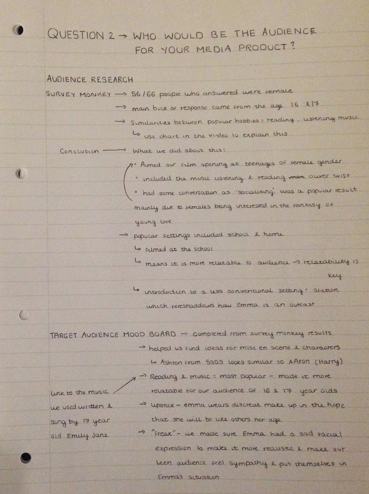
Age group interest charts
As survey monkey doesn't create charts for interests which people have, so i made my own graphs in microsoft exel. The main bulk of reponses came from people of at the age of 16 and 17. This graph indicates that watching films (including going to the cinema), reading, listening to music, spending time on social media and socialising is what the majority like to spent their free time doing. After doing genre research we found similarities between the intersts of our audience from survey monkey and with the interests of the outcasts in teen romance films. these included: 
- reading
- listening to music 
- watching films 
The only element which differs in the socialising part. This is because stereotypically outcasts tend to keep themselves to themselves and avoid socialising with other people as they feel as though they don't fit in. However, to make the film more relatable we will have to include a small aspect of socialisation. Maybe even if it just the boy who she meets that she socialises with: we still need to include a form of contact with another person. 


Are you male or female?
At the very beginning of the survey we asked what gender the person was who was filling out the form. From this we found that 56 people out of the 66 that answered the survey were females. 54 of these females were aged 16 and 17, others ranged above 17 to about 50 years old. Because of this, we knew already that females were more interested in filing out the survey after we told them it was a teen romance. Generally, the majority of the audience for a teen romance is a female as they are more interested in the fantasy side of things. Also, the fact that my group attend a girls school meant that most of our piers filled it out who were female. After this, we knew that we were going to aim our film at female teenagers as they seemed more interested.


How many of the following films have you seen? 
It was important that we addressed existing films when asking questions as they are our main inspiration for the opening. The film that was most popular was Twilight. It seemed as though this was a film which boys had seen too. Therefore this is a film that we will try not to be as similar to as we are aiming it at females. the second most popular was a Cinderella story. This film has a female protagonist and has a voiceover at the beginning with a misleading set up which seemed to be something that enticed the audience. Not only this but it has a theme of fantasy which seems to be popular amongst audiences when it comes to romances. The least watched film is pretty in pink. This is about how a girl must chose between the affections of her childhood sweetheart and a rich but sensitive playboy. I think that less people had watched this as it didn't appeal to them as much when seeing this advertisement. Therefore i think that it is a better idea to do a film which has just one boy who the girl likes from the very beginning, but have a small twist in the middle of the film.


If you have seen any of them, what did you enjoy? 
About 78% of people that filled out the survey said that the characters were the most important part of the film. From this, i think that it is important that we find someone who compliments the whole 'outcast' appearance and who can fill the role well in order for it to look as realistic as possible. This can be because they enjoy doing the stereotypical free time activities, not because of their appearance as we can use mise en scene to adjust this factor. The plot was the second most important thing. In order to guarantee a good opening, we will have to write the plot of the rest of the film so that we know how we are going to leave the opening in a cliff hanger leaving them wanting to see why the film has opening in such a way. 30% of people said that the relatability was important which is what we have a big focus on already. This is because both the survey, the interviews and the focus group said this was important.


What settings do you usually associate with a film aimed at teens?
Out of 66 people who answered the survey, 60 of them said that school was a place which they associate most with teen films. This is because most the people in chick flicks are the same age as the audience and are attending school, this makes the film look more realistic but also relatable for the audience. The second most voted setting was the home. Again, a place which teens spend a lot fo their time when they're not at school. I think that school and home are the two most important setting which we should definitely try to include in our film opening. 
I do, however think that it would be good to introduce a setting which isn't stereotypical which can foreshadow how our protagonist is not stereotypical as a teen and is an outcast. A place such as a train station which can have many different directions for a plot after the opening.


Link to survey monkey questionnaire: http://www.surveymonkey.com/s.aspx?PREVIEW_MODE=DO_NOT_USE_THIS_LINK_FOR_COLLECTION&sm=DpSFXAqhRIKjjV4rhtKChgSym3dZjbn9eNr61l1sXSg%3d

Sunday, January 26, 2014

Target Audience Mood Board


Target Audience Mood board
After looking at some of the survey monkey results, i noticed that most of the people that replied were 16 and 17. I then looked into what they like to do in their free time and the main thing was films, read and music. Due to these results i made sure that i included elements of these free time activities on the mood board.

This is one of the images on the mood board. Due to us having the idea that our teen romance is going to be one where either or both the characters are going to be an outcast, we included the usual things associated with outcasts. The library image can represent the reading aspect that out audience spend there time doing which means that they will be able to relate to the character a little more.

I also included this image of a bedroom due to Nicole saying that it where teens spend most their time in the target audience interview. This is the place which tends to tell you most about an individual: the tidiness of the room, the colours and the things that are actually in the room. For example in perks of being a wallflower, Charlie has a rustic desk with a typewriter on and a lot of writing equipment. straight away this tells you that he enjoys writing, does a lot of work, works hard at school, likes the less modern things compared to teens stereotypical style. This is what makes him seem like an outcast when you are first introduced to him.

The main character from the princess diaries is also on the board because she i known to be an outcast. She wants to conform to the 'normal' aspects of society but feels invisible.

I included small snippets of text in the collage as well. This quote reminded me a lot of the resposes that we got in the survey monkey as the free time activities seem to be ones which isolate an individual to their own devices. People tend to say that they go in their own world when they are listening to music, same as when reading books and watching films. Therefore this seemed relevant to our target audience. We also found that our audience prefered to have a female protagonist which can suggest that the 'she' is also relevant as we are most likely going to have a female protagonist as she will be more relatable.

This image of ashton from '5 seconds of summer' is on the collage as he conforms to the idea of a cute boyfriend that our target audience talk about. he doesn't look like a typical outcast/geek and doesn't look like a complete jock, therefore he would be perfect for the role of the male character in our opening.

The bird cage cartoon image in the corner is a great symbolisation of our protagonist in the story. From the research i did into the existing teenage romance dramas, i found that most the protagonist's can't express their true self and tend to hide away from the rest of society. So in this image the bird is the protagonist and the cage is revealing some parts of them to the audience but holding them beck from flying away to where they want to be.
There are then just smaller images on the board such as the lipstick, the backpack and the glasses which connote all the same kind of thing - how they are a bit of an outcast but wish they were seen to be a bit more normal then they are perceived to be. There is also a picture of a park to represent the response about typical settings associated with a teen romance from the target audience interview and fom looking at some of the answers on survey monkey.